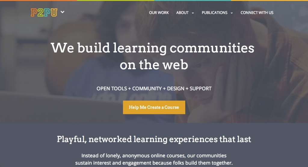
2014 has been a year of evolution for P2PU, and, like a caterpillar emerging from a cocoon, we’ve changed our look too. And because beauty is not just skin deep, we’d like to give you a bit of a tour around the spectacular butterfly that is the new p2pu.org

Our changes aren’t just superficial. We’ve spent a lot of time and thought on this website redesign, making sure that the changes we’ve implemented (and will continue to work on over the next few months) reflect the values and principles that guide everything we do at P2PU.
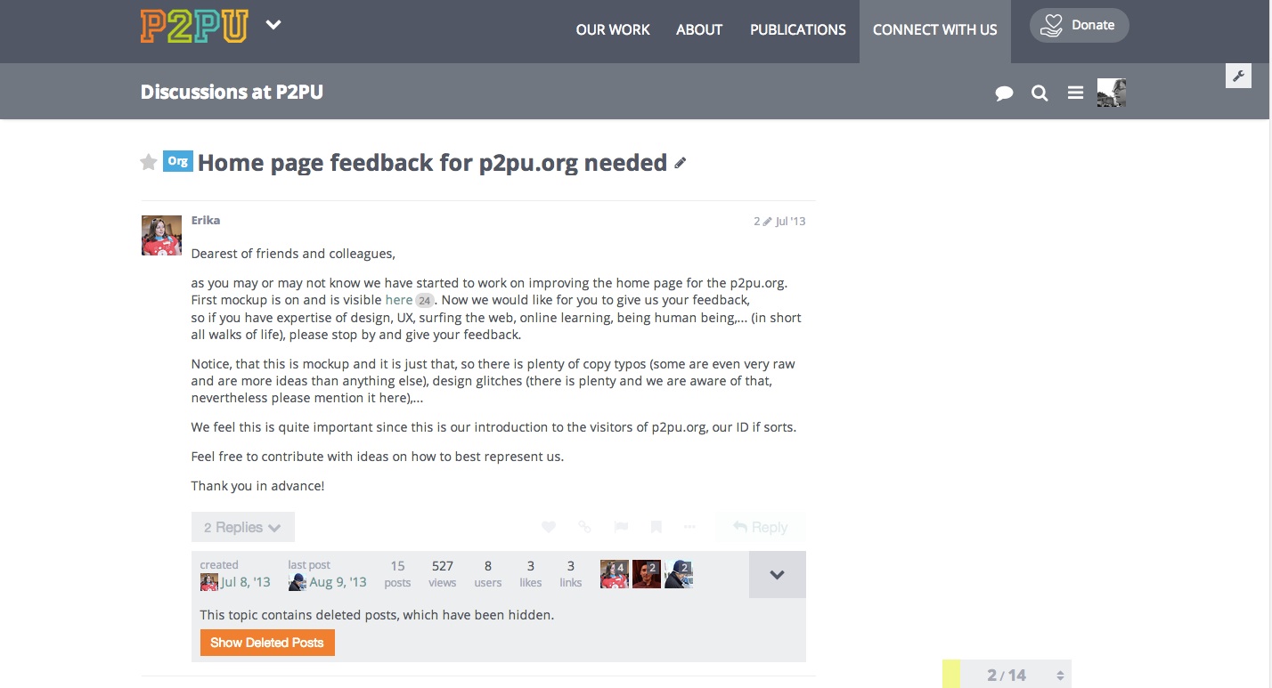
There was significant time spent time on thinking about which way our identity should go. We really wanted to make it express the changes we were and are still going through in the past year. We worked hard to identify our audience, and wanted to be sure that these changes reflect the P2PU move towards producing tools and recruiting people who are interested in experimenting with online education. We took your feedback, combined it with all of our new thinking and came up with this polished look.
The process has been somewhat a bit new and exciting for us too. We decided that everyone should be weigh in on presenting ourselves on the web, so we had a two day asynchronous sprint. This basically meant that everyone was working on a same project for two days. In a distributed team like ours that doesn’t happen all that often. It turns out, that this way of working together made us even more productive, when everyone picked a task they wanted to do and run with it. All in all it was fun process, even when Philipp was breaking things…
The design itself started out as a new CSS framework, that we were building through the process of redesign. We first used it on Writing for Change course, you know, to put it on a test run. The initial feedback was good, so we started to build heavily on our core page redesign. The framework is allowing us now to apply the new look of the P2PU on various systems without needing to wait for design, HTML and CSS experts. Of course we are still working on improvements, that is why we are also very happy when we get feedback from our community and people who are using all the things that we build with so much love.
We did this redesign because through time of p2pu the need for unified look on different entities emerged. Sort of like, this is our signature. We would like t this look to portray a trustworthy and enjoyable online learning experience for all the visitors, learners, facilitators, badge makers, and anyone else who uses p2pu.org
While mashing up the ideas of what P2PU will be in the future, we were often thinking about our roots, the place that we came from. We remembered the first time we got our bright logo and the color scheme ideas that were emerging through the brainstorms we had about what we think and want p2pu to be. So we decided to take the color scheme back to the roots. Did you know this was our initial colors, that were presented in the original p2pu.org site?
The next steps in our redesign, is to apply the new look to the rest of the systems, and to incorporate as much of the feedback that we get from you as possible. If you have any feedback for us please come here, we will be happy to listen. In the future we’re hoping to do some UX testing and will need as many eyeballs as we can get.
There are loads of ways you can get involved in the new-look-awesome P2PU:
- You could join one of our roundtables. You can find the aggregation of them here.
- Have a look at our projects page, speaking engagements, or people page.
- Or just introduce yourself on our Discourse forum.

